Showing posts with label #Rstats. Show all posts

Tuesday, December 31, 2013

A select few posts from 2013

Rstudio's Shiny enabled me to try out ideas on the Web.


** Creating Mazes


The most visitors came from these two posts:
Happy 2014, everyone.

Ram

Monday, October 28, 2013

Anand versus Carlsen - Chennai 2013 - What can we expect in November?


This year, the world chess championship will be played between Vishwanathan Anand and 22-yo Magnus Carlsen, in Chennai, India from the 9th to the 28th of November. The passions are sure to run strong. Both GMs have ardent supporters. Carlsen is in a dreamlike form, and Anand has the experience and the home field advantage. But what do the numbers say?

Let's use R to look at some data and see what we can infer.

The data comes from chessgames.com.  I took the raw data and created two new columns to facilitate my analysis. 1. A column called Anand.White (1 or 0) and 2. a column called Anand.won (which is a factor with 3 values: 0, Draw, 1). The cleaned csv files can be found here.

1. Lifetime tally

This is always a good place to start. We have data for a total of 62 games. Anand has a slight lead on this count, with 3 more wins than Carlsen. (Not distinguishing between rapid and standard games here.)

In R, we can simply run the table() command on the Anand.won column.

 Loss  Win   Draw
  11   14     37 

2. How has each GM grown in strength

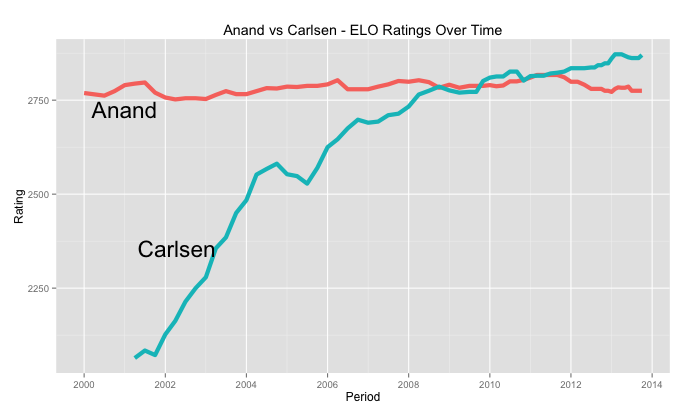
We can use ELO ratings since 2000 to see how both GMs have performed over time. Anand, of course, has been in the top 5 in the world for the past two decades, pretty much since Carlsen was born! But the visual showing Magnus' meteoric rise is quite striking. (The data comes from FIDE.com and can be found here.)

3. Win-Loss-Draw record by Year

Let's say we want to look, year by year, how the two GMs have fared against each other. R has this great package called "plyr" which is tailor made for these kinds of "Split-Apply-Combine" type analyses. We are splitting the data by year, and combining based on win-loss, and plotting the tallies. The plotting package ggplot plays well with the output of plyr.


Once we do the plotting, we get a sense of what has been happening. In the early 2000s, Anand had a much higher share of wins. Overall the number of draws has gone up over the years. But Carlsen has had the upper hand the last year or two. (Of course, the number of games is too small, and we should be careful about "inferring" when the data is this tiny.) That said, we could make a strong the case that Carlsen has the momentum going for him.

4. Choice of Openings

Finally, we know that both GMs are holed up somewhere with their team of seconds and coaches, preparing. What do these experts prepare? A good majority of the times they are preparing opening surprises to spring on their opponents. They are studying each others' games looking for weaknesses. By looking at how their choice of openings helped them in the past, we can make a broad guess about what they might go.

R allows us to slice the data by their choice of openings, and we can see how they fared.

So we can expect that Anand will favor the openings that have more "green" (wins) for him, while Carlsen will try to play the openings that have been "red" (losses) for Anand.

By this logic, we can expect Anand to opt for the Queen's Gambit Declined-semi-slav(D47), the Ruy Lopez, closed (C96)  or the Sicilian closed (B23). Magnus will be trying to steer the game towards the English (A20) or the Benko (A58) which are slightly more unorthodox, but have served him well against Anand. The expansions behind the ECO list can be found here.

Of course, there will always be surprises. (This is where it all gets game-theoretical. If only it were this easy to predict...) And that's why we should watch what unfolds this November.

The R code used can be found here.

Ram

Monday, August 26, 2013

Using R to visualize Karpov-vs-Kasparov Lifetime winner-take-all tally

The Karpov vs. Kasparov rivalry holds a special place in the chess world.

The idea behind this analysis is simple. If we take their lifetime games, plot the wins, what would it look like? We introduce one twist -- we'll be plotting the "winner-take-all" tallies, meaning that for every year, every five years, and every decade, we declare one person to be the 'winner'.

First, a note of caution: "Winner-take-all" type analyses lose a lot of information due to the roll-up. Whether a GM wins by 1 game, or a dozen games in a given year, he still gets only one "win".

At the outset, I must mention that this is NOT a chess exercise. I am ignoring the colors (whether each player had White or Black pieces) and even more egregious, I don't differentiate between standard and rapid games, or exhibition games. Time controls are ignored, as are openings.

This is a visualization exercise, and the idea is to see how it all looks when plotted.

I scraped the data from chessgames.com - where they have 201 games that the two have played. (I cleaned up the data and the csv file is available in github for anyone who wants to do their own analysis.) I use plyr to aggregate the data, and ggplot for the visualization. I wanted to try out this "pianogram" type visualization, where each plot looks like piano-keys.

Let's get the basics out of the way:

201 games - 138 draws,  37 wins for Kasparov, 26 for Karpov

Overall, Kasparov pretty much dominated Karpov. But how are these wins and losses spread across time? The two played for a little over 30 years.

The Winner-Take-All Method
In any given time period, say 1990, there can be 4 possible outcomes:
No games played, Equal number of wins, Karpov won, or Kasparov won. (If both players had the exact same number of wins in a given time period, we label that a Draw.)

Thanks to the 'plyr' package and ggplot, we can calculate the by-year, "5-year Winner" for each half-decade, and also the decade-wise winners by writing one function, and calling it with ddply.


So here's what the Yearly-Winner-Take-All looks like:

Let's plot the half-decade and decade plots. Again, note that only one GM is declared the winner for the entire decade, no matter what the difference in the scores are.


Now, we can put it all together, in one graph.


As a very quick summary, we can see that Karpov started out strong, the entire 80's was a draw, and then Kasparov took over.

The complete R code to reproduce this analysis is available in this gist, along with the data-file in CSV file.


Wednesday, August 21, 2013

What are the hottest areas for CS Research? (Based on Google Research 2013)

What are some of the hottest areas of research in Computer Science at the moment (August 2013)? And at which universities is this research being carried out?
The answers are subjective by definition, but looking at the numbers behind the Google Research awards announced yesterday can provide some quick insights. Going by the grants as a proxy for what are where are the current hottest areas of research, here's what we get:

A total of 105 grants were awarded. 81 universities in all got the awards, in 19 different research areas.

Here are the top research areas:


As far as institutions go, MIT, Georgia Tech and CMU got 5 grants each, with Cornell and Standford getting 3 each.

The R code I used to generate this can be found here. In case anyone is interested in performing their own analysis, I've also included the CSV data file.


Friday, July 19, 2013

Using R and Shiny to create “Art”

One big strength of packages like shiny is the ability to easily vary parameters and view the results, especially in plots.

So here’s a small shiny app that I created to learn about reactivity, while also having fun.


The idea is simple. Vary many aspects of geom_segments in ggplot, and see what emerges. The things that I played with are canvas size, line origin and destination, line length, the angle and the colors.

Because it is art, I made the background black.

There were many experiments that didn’t appeal to me aesthetically. Others seemed very repetitive. The ones that seemed okay, I kept.

Take a look at the shiny app ShinySketch.

here:

The code can be found on github.

Wednesday, July 3, 2013

Using R and Integer Programming to find solutions to FlowFree game boards

Using R and Integer Programming to find solutions to FlowFree game boards


What is FlowFree?
A popular game (iOS/Android) on a square board with simple rules. As the website states: Connect matching colors with pipes to create a flow. Pair all colors, and cover the entire board to solve each puzzle in Flow Free.

If you play a few games, you will be able to follow this post better. The games get progressively harder as you increase the board size.

 The solutions to the various levels are available on the web, but it is fun to use R (and the lpSolveAPI package) to come up with solutions ourselves.

So let's say that the board is made up on n "cells" (small squares) on each side. A pipe can enter a cell from the center of any side. So each cell has 4 edges.

 Figure: A cell with 4 edges meeting at the center

Terminal cells - Those cells where a colored-strand begins or ends. (Only one edge can be on in that cell.)

The 'rules' that we need to incorporate into our IP model
* The lines cannot cross.
* All the cells (squares) must be covered
* The colored lines must begin and end where they are shown

Decision variables

The problem comes down to deciding which edges to turn on, and which ones to leave off. An edge has a color and a cell. X_cke is 1 if edge e of color k in cell c is valid. 0 otherwise.

The constraints in English

  1. Cell Cover Constraints: Every cell has to have 2 edges that turned on. (One to come in, one to exit) 
    1. Special case: Terminal cells have only one edge that can be 1. All other edges are 0. 
  2. An Edge can have only one color (LimitEdge constraints) 
  3. Horizontal Connectivity - If two cells are horizontal neighbors (side by side), then the value of the east edge of the left cell must be the same as the west edge of the cell on the right. 
  4. Vertical Connectivity - If two cells are vertical neighbors (one on top of the other), then the value of the downward edge of the top cell must be the same as the upward edge of the bottom cell 
  5. Boundary Edges - Certain edges for the cells in the boundary of the board are made zero. (For example, in the 4 corner cells, at most 2 edges can be 1.) 
  6. Single color in Terminal Cells - Each terminal cell has a pre-determined color given to us as input, so we can set of the edge varibles of every other color to be zero.
  7.  Same color per cell & Pick 1 constraints. We set 0/1 variables and make sure that if a color is one inside a cell, ONLY that color edges are allowed in that cell.  (These are dense constraints and can make solution times explode for larger grids.)

Load one specific Puzzle


All of the work of  creating the matrix, the right hand side are done by 3 functions - init(), populate.Amatrix() and defineIP(). [See github for the code] Now, let's initialize an empty data frame, based on number of constraints and variables that the IP will have.


Getting the problem ready for LPSolve


After using lpSolveAPI's solve() function, we plot the solution using ggplot2 to recreate the board and show the pipes in them.

Let's try one problem:

>plotProb(terminal.cells, colorpalette)


Here are the 8 terminal cells for this problem:
> terminal.cells
  X Y color palette tcell
1 1 2     1   green     6
2 5 4     1   green    20
3 1 1     2    blue     1
4 2 4     2    blue    17
5 3 4     3  yellow    18
6 4 2     3  yellow     9
7 3 1     4     red     3
8 4 4     4     red    19

We create the linear program, and solve it using lpSolve

Let's see how many edges have non-zero values:
> lpff <- make.lp(nrow=n.row, ncol=n.col)
> defineIP()
> lpff
Model name:
  a linear program with 500 decision variables and 458 constraints
> solve(lpff)
> sol <- get.variables(lpff)
> sum(unlist(sol[1:num.edges]))
[1] 42
> plotSol(terminal.cells, colorpalette)
 
 produces the solution:


And here's the solution when I tried an 8x8 (Level 17) grid:

Note: Because of same-color and pick-1 constraints, this problem explodes in size as n (the size of the grid) increases. There are however, ways to address it, using relaxation.

Future Improvements: The addition of the pick-1 and the same-color constraints spoil the structure of the A-matrix and increase the solution time. These can be made optional, in which case the solution will require manual intervention.


You can download the full R code from github.

Useful Links:
1. Linear programming in R: an lpSolveAPI example (fishyoperations Blog)
2. Using lpSolve from R (I started with their working example)


Tuesday, April 2, 2013

R Beginners - Plotting Locations on to a World Map

This post is targeted at those who are just getting started plotting on maps using R.

The relevant libraries are: maps, ggplot2, ggmap, and maptools. Make sure you install them.

The Problem

Let's take a fairly simple use case: We have a few points on the globe (say Cities) that we want to mark on the map.

The ideal and natural choice for this would be David Kahle's ggmap package. Except that there is a catch. ggmap doesn't handle extreme latitudes very well. If you are really keen on using ggmap, you can do it by following the technique outlined in this StackOverflow response.
 If ggmap is not mandatory, there are simpler ways to do the same.

First, let's set up our problem. We'll take 5 cities and plot them on a world map.


Method 1: Using the maps Package


This results in:

Which might be enough. However, if you take the few extra steps to plot using ggplot, you will have much greater control for what you want to do subsequently.

Method 2: Plotting on a World Map using ggplot 


This results in:

Monday, March 18, 2013

R - Simple Recursive XML Parsing

This is intended for those who are starting out in R and interested in parsing an XML document recursively. It uses DT Lang's XML package.

If you want to just read certain types of nodes, then XPATH is great. This document by DT Lang is perfect for that.

However, if you want to read the whole document, then you have to recursively visit every node. Here's the way I ended up doing it. The generic function visitNode could be useful if you are just starting out reading XML in R.

The full code, along with a sample XML file to test it is here.


Friday, December 2, 2011

O'Reilly's Data Science Kit - Books

It is not as if I don't have enough books (and material on the web) to read. But this list compiled by the O'Reilly team should make any data analyst salivate.

http://shop.oreilly.com/category/deals/data-science-kit.do

The Books and Video included in the set are:

  1. Data Analysis with Open Source Tools
  2. Designing Data Visualizations
  3. An Introduction to Machine Learning with Web Data (Video)
  4. Beautiful Data
  5. Think Stats
  6. R Cookbook
  7. R in a Nutshell
  8. Programming Collective Intelligence

Monday, October 17, 2011

Get the Basics right - Suggestion for R Beginners

I am always looking for suggestions on how to get better at R, esp. for beginners. So when I see someone who's gotten adept at it, I ask them how they got there.

This weekend, at the Bay Area ACM Data Mining Camp, one person gave me what seemed like a good suggestion. Just wanted to share it here, for anyone else who's just getting started.

He told me that there are tons and tons of libraries, and if you start going down that path, you might know how to use a library or two, but you may not learn the basics of data manipulation, which is one of R's main strengths.

His suggestion:
Get some data and learn to manipulate it - understand the differences between vectors, data-frames, arrays and matrices. Once you have this down, only then should you start exploring the different libraries. Don't rush in to try every new library that someone praises.

Sunday, October 16, 2011

Geo-doodlers - Paul Butler and FlowingData

I found this great R-Visualization example via an R-Blogger post that xingmowang made. (One more good reason for why it is important to read lots of field-related blogs!)

Here's the image:

If this was merely eye-candy, I would have enjoyed it, but not included it here. But to think that this was done in R -- that means the rest of us can learn from it!

When Paul Butler writes about how he created it, he shares with us how he had to tweak it, and how the results surprised him. That is true data-doodling. You guide things along, but then the data surprises (or delights) you.

I also like this small bit of musing that he includes:
What really struck me, though, was knowing that the lines didn't represent coasts or rivers or political borders, but real human relationships. Each line might represent a friendship made while travelling, a family member abroad, or an old college friend pulled away by the various forces of life.
For those of us who are new to R, this example has a few things to try. Take any dataset with Lat/Long values in it, and plot it over a world map. Once you can do that successfully, try this.
(Also pointed out courtesy of Xingmowang.)

We may not all create infographics that are great, but these examples will point us in the right direction.

Wednesday, October 12, 2011

A true data-doodler - Christophe Ladroue (R ddly and plyr on Triathlon Results)

To me, this post by Christophe Ladroue personifies what data doodlers do.

They take a dataset that is of interest to them (In his case, his triathlon results) and then they manipulate the numbers to see what insights can be drawn. Most bloggers only show their final results which look great, but for our purposes (for wannabe data doodlers) it is much more fun to see the process. It is often messy, but that's the way we learn.

In Christophe's example, you will see some data cleanup, then he plots averages and medians across categories. Then he starts to try to squeeze insights out of the day. That is true data analysis.

Check out his full post.