Sunday, October 9, 2016

PyData DC - Links to 2016 Talks


PyDataDC2016 was held from October 7th-9th 2016.

Check out the schedule: http://pydata.org/dc2016/schedule/

Here are the links to some of the talks.

The talks have been grouped by the following categories:
Directly Python Related | Machine Learning | Data Analysis | Database Related | 
NLP | Scheduling | Security | Other Topics

Talks

Directly Python Related

The 5 Kinds of Python Functions: Steven Lott
  Slides: https://slott56.github.io/five-kinds-of-python-functions/assets/player/KeynoteDHTMLPlayer.html


Learn How to Make Life Easier with Anaconda: Dhavide Arulia
  Twitter: 
  Slides (pdf)
  Jupyter Notebooks & Data: https://github.com/dhavide/PyData-DC-2016-Anaconda


Sustainable Scrapers: David Eads / @eads
  Google Docs


Open Data Dashboards & Python Web Scraping: Marie Whittaker
  Twitter: @MarieCWhittaker
  Presentation: https://github.com/mseew/Presentation-Slides/blob/master/pyData_MCW.pdf
  Github: https://github.com/mseew/DM-Dashboard


Agent-based Modeling in Python: Jackie Kazil
  (Mesa Framework)
  Twitter: @JackieKazil
  Github: https://github.com/projectmesa/Mesa


Machine Learning Related


Variational Inference in Python: Austin Rochford
  Twitter: @AustinRochford
  Slides: http://austinrochford.com/resources/talks/dydata-dc-2016-variational-python.slides.html#/ …   Jupyter notebook 1:
  https://nbviewer.jupyter.org/gist/AustinRochford/91cabfd2e1eecf9049774ce529ba4c16
  Jupyter Notebook 2: Dependent Dirichlet Process Regression


Clustering talk (McInnes & Healy) 
HDBScan
Twitter: @dvbalen
Jupyter Notebooks: https://github.com/scikit-learn-contrib/hdbscan

Logistic Regression: Behind The Scenes: Chris White
Twitter: @markov_gainz
Slides: http://www.slideshare.net/ChrisWhite249/logistic-regression-behind-the-scenes

Visual Diagnostics for more informed Machine Learning: Rebecca Bilbro
Yellowbrick
Twitter: @RebeccaBilbro
Slides: https://rebeccabilbro.github.io/pydata/#/
Github: https://github.com/DistrictDataLabs/yellowbrick

Building Serveless ML Models in the Cloud: Alex Casalboni
Github: https://github.com/cloudacademy/sentiment-analysis-aws-lambda


Data Exploration & Analysis


Building Your First Data Pipelines: Hunter Owens
Twitter: 
Presentation: http://hunterowens.net/data-pipelines/presentation/#/
Github: https://github.com/hunterowens/data-pipelines

Creating Python Data Pipelines in the Cloud: Femi Anthony
Twitter: @DataPhanatik
Slides: https://github.com/femibyte/data-eng/blob/master/PyData2016-DataPipelinesCloud.pdf
Github: See the references (last slide) in the presentation above

Parallel Python - Analyzing Large Data Sets: Aron Ahmadia, Matthew Rocklin
Github: https://github.com/mrocklin/scipy-2016-parallel

Transforming Data to Unlock Its Latent Value: Tony Ojeda 
EDA Framework
Twitter: @tonyojeda3
Jupyter Notebook

Time series exploration with matplotlib: Thomas Caswell
Twitter: @tacaswell
Github: https://github.com/tacaswell/interactive_mpl_tutorial

Forecasting Critical Food Violations at Restaurants using Open Data: Nicole Donnelly
Twitter: @NicoleADonnelly
Presentation: Slideshare
Github:https://github.com/nd1/DC_RestaurantViolationForecasting

Doing Frequentist Statistics in Python: Gustavo A. Patino
Github: https://github.com/gapatino/Doing-frequentist-statistics-with-Scipy


Database Related


NoSQL doesn't mean No Schema: Steven Lott
Twitter: @s_lott
Presentation


GraphGen: Conducting Graph Analytics Over Relational Databases
 Twitter: 
http://konstantinosx.github.io/graphgen-project/


Natural Language Processing
What you can learn about food by analyzing a million Yelp reviews: Patrick Harrison
  (Modern NLP in Python)

Machine Learning with Text in scikit-learn: Kevin Markham
Github: https://github.com/justmarkham/pydata-dc-2016-tutorial


Scheduling Related

Dask: Fine Grained Task Parallelism: Matthew Rocklin


Security

Eat Your Vegetables: Data Security for Data Scientists: William Vorhees
http://www.slideshare.net/WilliamVoorhees1/eat-your-vegetables-data-security-for-data-scientists


Other Topics


Keynote: A Dept of Commerce Conundrum: Star Ying
Slides: http://www.slideshare.net/StarYing1/pydata-dc-2016-a-doc-conundrum

Becoming a Data Scientist: Advice From My Podcast Guests: Renee Teate
Twitter: @BecomingDataSci
Slides & The slide notes are here.

Python Users: Daniel Chen
Github: https://github.com/chendaniely/2016-pydata-dc-python_useRs


Semi-autonomous Drone: YHat
https://github.com/yhat/semi-autonomous-drone

Data Sciencing while Female: Amanda Traud
Slides: Google Doc 
Shiny App: https://netmandi.shinyapps.io/DSMeetups/

Julia Tutorial: Chase Coleman
Github:https://github.com/cc7768/PyDataDC_julia


Thanks to Bhavika Tekwani & Renee Teate for help with a number of these links.
#PyDataDC2016

Wednesday, March 9, 2016

538 Riddler: Hot New Game Show - Computing probabilities for Winning

BiggerNumberGame

ThreeFiveEight - Hot Game Show Riddler

This is an attempt at solving this ridder by the folks at 538.

This entire post is a Jupyter notebook, and it uses Python (Pandas and Numpy) to explore different aspects of the riddle.

The Problem

Two players go on a hot new game show called â€Å“Higher Number Wins.” The two go into separate booths, and each presses a button, and a random number between zero and one appears on a screen. (At this point, neither knows the other’s number, but they do know the numbers are chosen from a standard uniform distribution.) They can choose to keep that first number, or to press the button again to discard the first number and get a second random number, which they must keep. Then, they come out of their booths and see the final number for each player on the wall. The lavish grand prize — a case full of gold bullion — is awarded to the player who kept the higher number. Which number is the optimal cutoff for players to discard their first number and choose another? Put another way, within which range should they choose to keep the first number, and within which range should they reject it and try their luck with a second number?

Note: If you have attempted this problem first, then you can follow along easily and see where the approaches vary from what you attempted.

Solution Approaches

There are at least two good ways to approach this riddle. If you are a programmer and like to let the computer all the hard work, then a numerical simulation approach is the first thing that will occur to you. On the other hand, if you like to work out probabilities, then you prefer the analytical approach.

We will start with the Numerical Simulation approach, then also calculate the probabilities.

Intuition

Before we even begin calculating, our intuition strongly suggests that a player would want to use 0.5 as the cutoff. But can we prove this? This post is an attempt to see if our initial guess was correct.

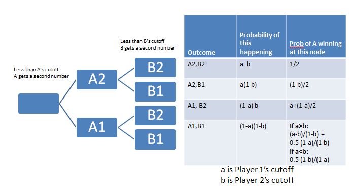
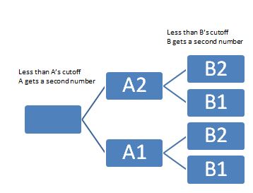
As it turns out, things are easier if we think of the events of this Game Show as a decision tree.

Decision Tree

Image of dtree

Method 1: The Numerical Simulation Approach

Let's say this game was played a million times. We can simulate that using Uniform random numbers. We can then count out the number of time each player won, under different scenarios. The scenarios in this experiment would be the different cutoffs that each player decides on.

In [154]:
%matplotlib inline
import matplotlib
import matplotlib.pyplot as plt
import numpy as np
import pandas as pd
import sys, os
In [252]:
millU = np.random.uniform(0,1,int(4e6)).reshape(1000000,4)
df = pd.DataFrame(data=millU, columns=['a1','a2','b1','b2'])
In [253]:
df.shape
Out[253]:
(1000000, 4)
In [254]:
df.head()
Out[254]:
a1 a2 b1 b2
0 0.678229 0.906019 0.140983 0.691082
1 0.242459 0.210721 0.816614 0.172865
2 0.473276 0.731607 0.710147 0.124943
3 0.289715 0.730348 0.575624 0.980886
4 0.300231 0.651216 0.122309 0.416013

Compute "Prob of Player A winning" for different CUTOFF point choices for each player

Now that we have a ready-made million row dataframe at our disposal, we can try out as many experiments as we like.

For example, we could choose a cutoff for A, and one for B, and see how often player A ends up winning.

Let's try it out. Say Player A chooses to stand at 0.2. (Meaning that if player A gets above 0.2, they won't ask for different number.) Meanwhile, Player B chooses to go for a bigger cuttoff. That player chooses 0.7 as their cutoff. In this scenario, how often will player A win?

We can do that easily by creating a couple of new columns in our dataframe, and seeing which of those two final numbers is greater. We can then convert that number to a percentage, since we know we have a million rows.

In [413]:
CUTOFF_A = 0.2 #The number above which A will not ask for another hit (second number)
CUTOFF_B = 0.7 #The number above which B will not ask for another hit (second number)

#Create two new columns
df['Final_A'] = (df['a1']<CUTOFF_A)*df['a2']+ (df['a1']>CUTOFF_A)*df['a1']
df['Final_B'] = (df['b1']>CUTOFF_B)*df['b1'] + (df['b1'] < CUTOFF_B) * df['b2']

#Finally, we create a column of True/False to denote who won
df['A_Won'] = (df['Final_A']>df['Final_B'])
prob_A_winning = (df['Final_A']>df['Final_B']).sum()/1e6
print prob_A_winning
0.460286

That seems to work. Now, we could just do this for many, many pairs of cutoffs. Which is what we are going to do next.

But before that, if makes sense to make the computation above into a Python function. Let's make it a function, so that we can call it repeatedly, giving it different A and B Cutoff values.

Writing a Function to Simulate the Win Probability

In [422]:
def prob_A_winning_simulation(CUTOFF_A, CUTOFF_B):
    df['Final_A'] = (df['a1']<CUTOFF_A)*df['a2']+ (df['a1']>CUTOFF_A)*df['a1']
    df['Final_B'] = (df['b1']>CUTOFF_B)*df['b1'] + (df['b1'] < CUTOFF_B) * df['b2']
    df['A_Won'] = (df['Final_A']>df['Final_B'])
    return (df['A_Won']).sum()/1e6

Let's test it to see if this function is working as we would expect.

In [424]:
print prob_A_winning_simulation(0.2, 0.7) #does it match what we computed before?
print prob_A_winning_simulation(0.33, 0.75)
print prob_A_winning_simulation(0.1,0.1)
0.460286
0.499826
0.499114

Running a Grid of Cutoffs

Now that we have a function ready, we can let the a and b cutoff's vary from 0 to 1, get the probability of A winning in each case, and store those. In this case, let's say that we take steps of 0.02, so there will be 50x50 = 2500 runs we make. So, the results list will have 2500 rows.

In [425]:
results = []
step = 0.02
nparray = np.arange(0,1,step)
for sta in  nparray:
    for stb in  nparray:
        results.append((sta, stb, prob_A_winning_simulation(sta, stb)))
        
        
sim_results_df = pd.DataFrame(results, columns=['A','B', 'probA']) #cast the results in a pandas df
In [565]:
#sim_results_df[sim_results_df['B']==0.5]

Logically, the next step is to examine our results data frame. We want to know the cutoffs for A which helped the most.

In [470]:
rcParams['figure.figsize'] = 3, 3 

fig = plt.figure()
data = sim_results_df[sim_results_df['B']==0.5]
data.plot(x='A', y='probA')
plt.suptitle('Win Probabilities over cutoff values, if opponent chose 0.5 as the cutoff')
plt.xlabel('cutoff for player')
plt.ylabel('probability of winning')
plt.xlim(0.48, 0.7)
Out[470]:
(0.48, 0.7)
<matplotlib.figure.Figure at 0x33ac2198>

Plotting Functions

Next, let's create a couple of plotting functions (using MatPlotLib in Python) which we can call to create surface plots. For now, you can skip over these. (Refer to them if you are interested in recreating similar plots. I have used pcolor. In the winloss plot, I use only two colors. One to show cells where the probability of winning is above 0.5, the other to denote lower than 0.5. In the other surface plot, the color indicates the probability value. 1.0 is green, and 0.0 is red.

In [661]:
def plot_winloss(rdf, step):
    from pylab import rcParams
    rcParams['figure.figsize'] = 8,8
    
    nparray = np.arange(0,1,step)
    width = len(nparray)
    fig, ax = plt.subplots()
    data = (rdf['probA']>=0.499999).values.reshape(width, width)
    heatmap = ax.pcolor(data, cmap="autumn")

    # put the major ticks at the middle of each cell
    ax.set_xticks(np.arange(data.shape[0])+0.5, minor=False)
    ax.set_yticks(np.arange(data.shape[1])+0.5, minor=False)

    # want a more natural, table-like display
    ax.invert_yaxis()
    ax.xaxis.tick_top()

    ax.set_xticklabels(nparray, minor=False)
    labels = [item.get_text() for item in ax.get_xticklabels()]
    for idx,l in enumerate(labels):
        if (idx % 5):
            labels[idx] = ""
    ax.set_xticklabels(labels, minor=False)

    ax.set_yticklabels(labels, minor=False)
    plt.show()


def plot_win_surface(rdf, step):
    from pylab import rcParams
    rcParams['figure.figsize'] = 8,8

    #step = 0.02
    nparray = np.arange(0,1,step)
    width = len(nparray)

    fig, ax = plt.subplots()
    data = rdf['probA'].values.reshape(width, width)
    heatmap = ax.pcolor(data, cmap="RdYlGn")

    # put the major ticks at the middle of each cell
    ax.set_xticks(np.arange(data.shape[0])+0.5, minor=False)
    ax.set_yticks(np.arange(data.shape[1])+0.5, minor=False)

    # want a more natural, table-like display
    ax.invert_yaxis()
    ax.xaxis.tick_top()

    ax.set_xticklabels(nparray, minor=False)
    labels = [item.get_text() for item in ax.get_xticklabels()]
    for idx,l in enumerate(labels):
        if (idx % 5):
            labels[idx] = ""
    ax.set_xticklabels(labels, minor=False)

    ax.set_yticklabels(nparray, minor=False)
    plt.suptitle('Win Probabilities Heatmap')
    plt.xlabel('cutoff chosen by opponent')
    plt.ylabel('Cutoff chosen by Player')

    plt.show()

Let's now plot our simulation results.

In [662]:
step = 0.02
plot_win_surface(sim_results_df, step)
plot_winloss(sim_results_df, step)
In [615]:
prob_A_winning(0.6,0.5)
Out[615]:
0.50490000000000002

The numerical simulation is working. Let's also try calculating the probabilities.

Method 2: Analytical Approach: Calculating the probability

Developing some Intuition

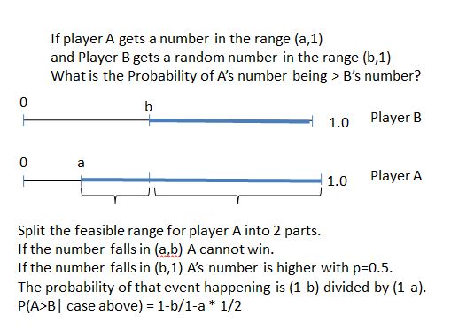
We know that the probability of a number U(0,1) beating another number in the same range: U(0,1) is half. But what is the probability if the intervals are different? We can work that out...

Image

If a = 0.3 and b=0.7, this works out to be (1-0.7)/(1-0.3) * 0.5 = 3/14

In [654]:
cola = np.random.uniform(0.3,1,int(1e6))
colb = np.random.uniform(0.7,1,int(1e6))
#data = pd.DataFrame({'a': cola,'b':colb})
sum(cola>colb)/1e6, 3/14.0
Out[654]:
(0.214, 0.21428571428571427)

That matches. So now, we can work out the probability for each of the 4 cases in our decision tree.

Image of dtree

In [656]:
def analytical(a,b):
    '''
    Function returns the probability of Player A winning (getting a higher number)
    if player A chose a as the cutoff, and the opponent chose b as the cutoff
    '''
    pwin = a*b *0.5
    pwin += a*(1-b)*((1-b)/2)
    pwin += (1-a)*b *(a+((1-a)/2))
    ev = (1-a)*(1-b)
    if a > b:
        p = ((a-b)/(1-b)) + (0.5 * (1-a)/(1-b))
        pwin += ev * p
    else: #a is smaller. a---1 vs b--1
        pwin += ev * ((1-b)/(1-a))*0.5
    return pwin
    

Let's see how well the analytical approach matches the numerical simulation...

In [614]:
acut = 0.6
bcut = 0.5
print analytical(acut, bcut), prob_A_winning(acut,bcut)
0.505 0.5049

That seems to match well. So looks like our analytical function is working. Now, let's just call it a bunch of times, with varying A and B cutoff values, and store the resulting probability in a results DataFrame (called 'rdf')

In [548]:
aresults = []
step = 0.01
nparray = np.arange(0,1,step)
width = len(nparray)
for sta in  nparray:
    for stb in  nparray:
        aresults.append((sta, stb, analytical(sta, stb)))
        
rdf = pd.DataFrame(aresults, columns=['A','B', 'probA'])        

Let's examine the results. We can try plotting different aspects of rdf

In [663]:
step = 0.01
print rdf.shape
plot_win_surface(rdf, step)    
plot_winloss(rdf, step)
(10000, 3)
In [608]:
meanprob = []
for a in rdf.A.unique():
    cond = rdf['A']==a
    meanprob.append((a, rdf[cond]['probA'].mean()))
    
data = pd.DataFrame(meanprob, columns=["A", 'probA'])
data.plot(x='A', y='probA')

plt.suptitle('Mean Win Probabilities over all cutoff values for opponent')
plt.xlabel('cutoff for player')
plt.ylabel('probability of winning')
Out[608]:
<matplotlib.text.Text at 0x4c834e48>
In [668]:
rcParams['figure.figsize'] = 7, 7 

fig, ax = plt.subplots()

for temp in [x * 0.1 for x in range(0, 10)]:
    data = rdf[rdf['B']==temp]
    ax.plot(data['A'], data['probA'], label = "{0}".format(temp))

plt.suptitle('Win Probabilities over cutoff values')
#plt.axhline(y=0.5)
plt.axvline(x=0.61)

plt.xlim(0.4, 0.8)
plt.xlabel("A's cutoff")
plt.ylabel("Pr(A Winning)")
ax.legend()
plt.show()

From the plot above, we can see that if a player chooses a cutoff value of slightly above 0.6, they maximize their chance of winning the game show. (I.e., no matter what strategy the opponent chooses to adopt, the first player's win probability is above 0.5.)

In [669]:
cond = rdf['A']==0.62
print rdf[cond]['probA'].min(), rdf[cond]['probA'].max()
#compared against:
cond = rdf['A']==0.50
print rdf[cond]['probA'].min(), rdf[cond]['probA'].max()
0.5 0.6178
0.4948 0.625

It looks like our intuition didn't serve us well in this case.