Friday, July 19, 2013

Using R and Shiny to create “Art”

One big strength of packages like shiny is the ability to easily vary parameters and view the results, especially in plots.

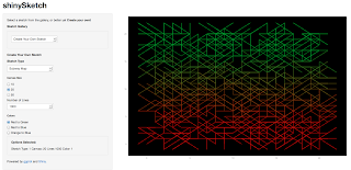
So here’s a small shiny app that I created to learn about reactivity, while also having fun.


The idea is simple. Vary many aspects of geom_segments in ggplot, and see what emerges. The things that I played with are canvas size, line origin and destination, line length, the angle and the colors.

Because it is art, I made the background black.

There were many experiments that didn’t appeal to me aesthetically. Others seemed very repetitive. The ones that seemed okay, I kept.

Take a look at the shiny app ShinySketch.

here:

The code can be found on github.

Wednesday, July 3, 2013

Using R and Integer Programming to find solutions to FlowFree game boards

Using R and Integer Programming to find solutions to FlowFree game boards


What is FlowFree?
A popular game (iOS/Android) on a square board with simple rules. As the website states: Connect matching colors with pipes to create a flow. Pair all colors, and cover the entire board to solve each puzzle in Flow Free.

If you play a few games, you will be able to follow this post better. The games get progressively harder as you increase the board size.

 The solutions to the various levels are available on the web, but it is fun to use R (and the lpSolveAPI package) to come up with solutions ourselves.

So let's say that the board is made up on n "cells" (small squares) on each side. A pipe can enter a cell from the center of any side. So each cell has 4 edges.

 Figure: A cell with 4 edges meeting at the center

Terminal cells - Those cells where a colored-strand begins or ends. (Only one edge can be on in that cell.)

The 'rules' that we need to incorporate into our IP model
* The lines cannot cross.
* All the cells (squares) must be covered
* The colored lines must begin and end where they are shown

Decision variables

The problem comes down to deciding which edges to turn on, and which ones to leave off. An edge has a color and a cell. X_cke is 1 if edge e of color k in cell c is valid. 0 otherwise.

The constraints in English

  1. Cell Cover Constraints: Every cell has to have 2 edges that turned on. (One to come in, one to exit) 
    1. Special case: Terminal cells have only one edge that can be 1. All other edges are 0. 
  2. An Edge can have only one color (LimitEdge constraints) 
  3. Horizontal Connectivity - If two cells are horizontal neighbors (side by side), then the value of the east edge of the left cell must be the same as the west edge of the cell on the right. 
  4. Vertical Connectivity - If two cells are vertical neighbors (one on top of the other), then the value of the downward edge of the top cell must be the same as the upward edge of the bottom cell 
  5. Boundary Edges - Certain edges for the cells in the boundary of the board are made zero. (For example, in the 4 corner cells, at most 2 edges can be 1.) 
  6. Single color in Terminal Cells - Each terminal cell has a pre-determined color given to us as input, so we can set of the edge varibles of every other color to be zero.
  7.  Same color per cell & Pick 1 constraints. We set 0/1 variables and make sure that if a color is one inside a cell, ONLY that color edges are allowed in that cell.  (These are dense constraints and can make solution times explode for larger grids.)

Load one specific Puzzle


All of the work of  creating the matrix, the right hand side are done by 3 functions - init(), populate.Amatrix() and defineIP(). [See github for the code] Now, let's initialize an empty data frame, based on number of constraints and variables that the IP will have.


Getting the problem ready for LPSolve


After using lpSolveAPI's solve() function, we plot the solution using ggplot2 to recreate the board and show the pipes in them.

Let's try one problem:

>plotProb(terminal.cells, colorpalette)


Here are the 8 terminal cells for this problem:
> terminal.cells
  X Y color palette tcell
1 1 2     1   green     6
2 5 4     1   green    20
3 1 1     2    blue     1
4 2 4     2    blue    17
5 3 4     3  yellow    18
6 4 2     3  yellow     9
7 3 1     4     red     3
8 4 4     4     red    19

We create the linear program, and solve it using lpSolve

Let's see how many edges have non-zero values:
> lpff <- make.lp(nrow=n.row, ncol=n.col)
> defineIP()
> lpff
Model name:
  a linear program with 500 decision variables and 458 constraints
> solve(lpff)
> sol <- get.variables(lpff)
> sum(unlist(sol[1:num.edges]))
[1] 42
> plotSol(terminal.cells, colorpalette)
 
 produces the solution:


And here's the solution when I tried an 8x8 (Level 17) grid:

Note: Because of same-color and pick-1 constraints, this problem explodes in size as n (the size of the grid) increases. There are however, ways to address it, using relaxation.

Future Improvements: The addition of the pick-1 and the same-color constraints spoil the structure of the A-matrix and increase the solution time. These can be made optional, in which case the solution will require manual intervention.


You can download the full R code from github.

Useful Links:
1. Linear programming in R: an lpSolveAPI example (fishyoperations Blog)
2. Using lpSolve from R (I started with their working example)


Tuesday, April 2, 2013

R Beginners - Plotting Locations on to a World Map

This post is targeted at those who are just getting started plotting on maps using R.

The relevant libraries are: maps, ggplot2, ggmap, and maptools. Make sure you install them.

The Problem

Let's take a fairly simple use case: We have a few points on the globe (say Cities) that we want to mark on the map.

The ideal and natural choice for this would be David Kahle's ggmap package. Except that there is a catch. ggmap doesn't handle extreme latitudes very well. If you are really keen on using ggmap, you can do it by following the technique outlined in this StackOverflow response.
 If ggmap is not mandatory, there are simpler ways to do the same.

First, let's set up our problem. We'll take 5 cities and plot them on a world map.


Method 1: Using the maps Package


This results in:

Which might be enough. However, if you take the few extra steps to plot using ggplot, you will have much greater control for what you want to do subsequently.

Method 2: Plotting on a World Map using ggplot 


This results in:

Monday, March 25, 2013

R - Defining Your Own Color schemes for HeatMaps

This post is intended at those who are beginners at R, and is inspired by a small post in Martin's bioblog.

First, we plot a "correlation heatmap" using the same logic that Martin uses. In our example, let's use the Movies dataset that comes with ggplot2.

We take the 6 genre columns, and we can compute the correlation matrix for those 6 columns.
Here's what the matrix looks like:

> cor(movieGenres) # 6x6 cor matrix
                  Action   Animation      Comedy        Drama
Action       1.000000000 -0.05443315 -0.08288728  0.007760094
Animation   -0.054433153  1.00000000  0.17967294 -0.179155441
Comedy      -0.082887284  0.17967294  1.00000000 -0.255784957
Drama        0.007760094 -0.17915544 -0.25578496  1.000000000
Documentary -0.069487718 -0.05204238 -0.14083580 -0.173443622
Romance     -0.023355368 -0.06637362  0.10986485  0.103545195
            Documentary     Romance
Action      -0.06948772 -0.02335537
Animation   -0.05204238 -0.06637362
Comedy      -0.14083580  0.10986485
Drama       -0.17344362  0.10354520
Documentary  1.00000000 -0.07157792
Romance     -0.07157792  1.00000000


When we plot with the default colors we get:
It is difficult to see the details in the tiles. Now, if you want to better control the colors, you can use the handy colorRampPalette() function and combine that with scale_fill_gradient2.
Let's say that we want "red" colors for negative correlations and "green" for positives.
(We can gray out the 1 along the diagonal.)

Doing this produces:

If there are values close to 1 or to -1, those will pop out visually. Values close to 0 are a lot more muted.

Hope that helps someone.

References: Using R: Correlation Heatmap with ggplot2


Monday, March 18, 2013

R - Simple Recursive XML Parsing

This is intended for those who are starting out in R and interested in parsing an XML document recursively. It uses DT Lang's XML package.

If you want to just read certain types of nodes, then XPATH is great. This document by DT Lang is perfect for that.

However, if you want to read the whole document, then you have to recursively visit every node. Here's the way I ended up doing it. The generic function visitNode could be useful if you are just starting out reading XML in R.

The full code, along with a sample XML file to test it is here.


Monday, March 11, 2013

Simulating Allele Counts in a population using R

This post is inspired by the Week 7 lectures of the Coursera course "Introduction to Genetics and Evolution" (I highly recommend this course for anyone interested in genetics, BTW.) Professor Noor uses a Univ Washington software called AlleleA1 for trying out scenarios.

We can just as well use R to get an intuitive feel for how Alleles and Genotypes propagate or die out in populations.

Basic Scenario

There are N individuals in an isolated island. Say, we are interested in two specific Alleles (Big "A", or small "a"). This in turn means that they can have 3 types of genotypes: AA, Aa or aa. The individuals mate in pairs, and produce two offspring and die out. (Thus the total population remains the same generation after generation.)
The genotype of the offspring depends on those of the parents. A 'gamete' has only one parental allele, depending on what the parent's genotype was. AA type parent can only product gamete type A, aa parent can only produce gamete type a, but Aa can produce either type of gamete.

A Punnett square of parents gametes to offspring's genotypes. 

  | A  | a
 ---------------- 
A | AA | Aa 
a | Aa | aa 

With these simple rules, we can use R Simulation scripts to observe what happens to the Allele Frequencies over generations. (The goal here is to learn to use R for Monte Carlo simulations.)

Writing the R Script from scratch

 I toyed around with the idea of using character strings for the genotypes and the alleles. But then I realized that are only three types and I could just as easily represent them with the numbers 1, 2, 3 as a simple R vector.


With that done, we can write very simple functions for the procreation process.
With these useful functions, we can take one generation and produce another, 2 offspring for each set of 2 parents.
Putting it all together to generate multiple trials:

We also need to compute the Allele counts for each generation, and for plotting I use ggplot.


Using this simple Monte Carlo "toy" we can develop quite a bit of intuition.


For small starting populations, either the big A or the small a allele takes over the entire population fairly quickly. Given large enough number of generations, invariably one of the alleles gets wiped out.


As one example, we can see that even a small increase in the probability of Allele A to be 0.53 (up from 0.5) makes it take over quite dramatically.


Conversely, setting it to any value under 0.5 means that the Big A allele gets wiped out of the entire population.


The entire R script can be found here. You can download the code and try playing with various starting scenarios, changing the starting population counts, generations and probabilities.


References:
  1. Coursera.org (Introduction to Genetics and Evolution by Md. Noor, Week 7 lectures) 
  2. AlleleA1 software at Univ Washington

Saturday, February 23, 2013

Simulating Population Growth in Cities Using R

R is great for anyone who wants to get started on learning Simulation. (Both Discrete Event or Agent-based, with stochastic elements in the process.)

This post is inspired by Matt Asher's "quick-and-dirty" R simulation work on Population Growth. Matt uses it to create aRt. I felt that his core idea provided a very good framework to introduce various concepts of simulation.

The Basic Idea behind this Simulation

We take an area (it could be a country, state, city) that is made up of units (cells) that can be settled (occupied).
We allow the initial 'pioneers' to settle first. (Seeding the cells)
We then establish some rules for future residents to settle. (Settling Rules)
Plot the area, and collect some stats to study the growth of the population under different starting conditions and different settling rules.

Pseudo-Code for the Simulation

Define parameters: Area Width, Height
Number of Pioneers P and future settlers S

for each pioneer p{ 
  settle p according to seeding rules in a valid cell in the area
}
for each settler S{
  Find an unoccupied Cell.
  Settle S in that cell, if the settling criteria permits it
}
Print Iterations Stats
Print out the Plot of the Area

A Few Changes from Matt's R code

  1. I switched from his matrix to a dataframe. I also switched from his image to ggplot.
  2. Delineated the initial parameters, seeding and settling clearly so that anyone who downloads the code can experiment
  3. Created a few different Seeding Functions for the pioneers (beyond random seeding)
  4. Matt allowed settling if the new cell was adjacent to an occupied cell. I played around with a few different population settling functions.  (rectilinear, diagonal etc).
  5. Added a function to collect a few statistics regarding population growth
  6. Ran the simulation a few 100 times (without plotting) to compare different growth and settling schemes

Color Coding the Population

  • Black cells : Unoccupied
  • Blue cells: Pioneers
  • Orange cells: Settlers who found a cell in 1-2 attempts
  • Yellow cells: Settlers who found a cell after more than 2 scouting attempts
The full R code I used for these R can be found here.

Here are some runs with a 30x30 area.

Here's what one run looked like. (Blue cells are the initial pioneers. The other colors represent the number of steps taken for them to find a home cell.)

Trying Out Different Seeding Schemes (for the pioneers)


As opposed to starting out with randomly strewn cells, what if we started out with a city downtown (a densely populated central rectangle) and let the settlers follow them?


I tried a rectangluar ring (annular cells for pioneers) starting point to see how the population grew inside and outside. So I used this seeding function:


One final seeding scheme I tried was to have two thick bands (columns of pioneer cells) and to let the population grow from there. Seeding function:


Different Population Growth Schemes

The default settling rule that Matt Asher uses is a very good one, one that I like. If a given cell is adjacent to any occupied cell (one of its 8 neighbors) then it becomes a valid cell to settle down in.

Just for experimentation, I tried a few other schemes.

1. Rectilinear Growth

Rule: You can only settle down in the 4 cells that are due N, S, East or West of an occupied cell.

2. Diagonal Growth

Rule: A settler can occupy any cell that is diagonally adjacent to another occupied cell.

The code can be found here.


Collecting Stats

Now that we have all the functionality that we wanted, it is time to start collecting some statistics for each run ('replication'). There are many possibilities for what we could collect in a population simulation.
Here are a couple:
  • How many settlers found a 'home cell?'
  • How many scouting attempts did each settler make before they found a home?

Making Multiple Replications


>st
  Iter FoundHome NumSettlers  Percent
1    1       243         350 69.42857
2    2       214         350 61.14286
3    3       213         350 60.85714
4    4       258         350 73.71429
5    5       235         350 67.14286

The full R code I used for these runs can be found here. Feel free to give it a spin and try out your own settling/growth schemes.
Reference: Matt Asher's post on his StatisticsBlog